12.10.1. FATCAT_matplot
Ready, ready, ready, ready, ready to run. [1]
- Make sure AFNI and R are installed and configured correctly.
Run
@afni_R_package_install -shiny -circosto install necessary R libraries.Put the output .grid or .netcc datasets in some folder.
Gotta get up to get down. [2]
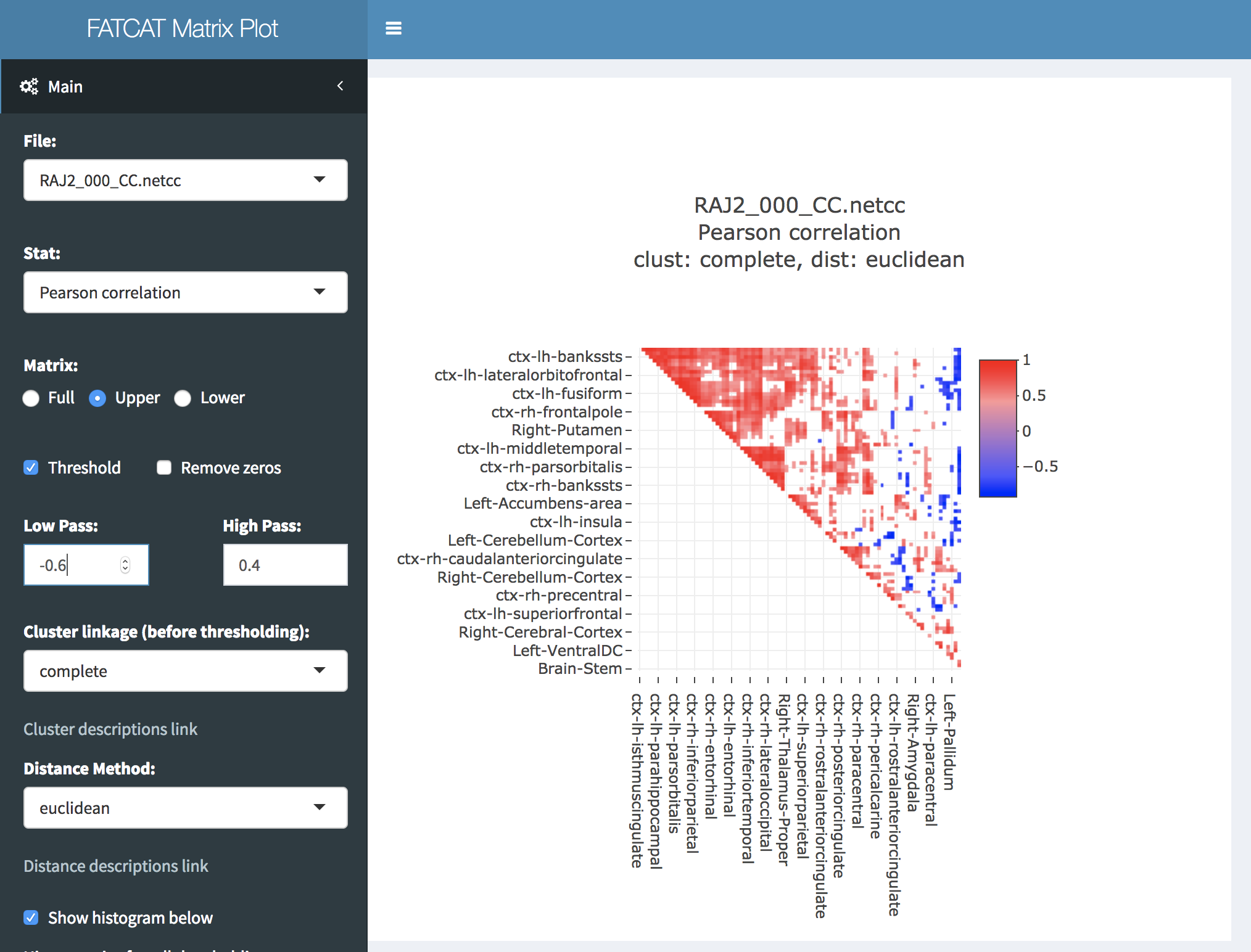
FATCAT_matplot ~/my_Netcc_filesWith “~/my_Netcc_files” being some folder with .netcc or .grid files. This will open your default web browser and read all valid datasets in “~/my_Netcc_files”.
FATCAT_matplot can also read non FATCAT or 3dnetcorr formatted datasets if they are in the following format:
The data must be a symmetrical square matrix.
There must be row and column names that match.
The row and column names must begin with a letter.
The first cell (upper left) must be empty.
The data needs to be saved as a tab or comma separated file.
The file extension needs to be one of the following: csv, tsv, dat, or 1d.
There can be NO other header information or comments.
So it should look like this:
roi1 |
roi2 |
roi3 |
roi4 |
|
roi1 |
1.0 |
0.2 |
0.3 |
0.4 |
roi2 |
0.2 |
1.0 |
0.5 |
0.6 |
roi3 |
0.3 |
0.5 |
1.0 |
0.7 |
roi4 |
0.4 |
0.6 |
0.7 |
1.0 |
The statistic selector will default to “none” because there is no information as to what the data represents.
Walking in your footsteps. [3]
Dataset Selector
Statistic Selector
ROI Selector
Zoom
Raw Histogram
Triangle
Threshold
Remove Zeros
Clustering
Log Files
Colors
Download Heatmap
Download Circos
Footnotes