12.4.2. APQC-HTML navigation: example
Description: the afni_proc.py command
We ran the afni_proc.py command in the “s05.ap.uber” script in the
AFNI Bootcamp data, which is located in the AFNI_data6/FT_analysis
directory. Briefly, this is a FMRI task data set (some audio and
visual stimuli) with three runs in a block design. While not every
feature of this example is super-modern (e.g., in real processing, we
strongly recommend telling afni_proc.py using nonlinear warping to
standard space), it runs in about 10 minutes or so and provides the
many important features for studying processing.
The only change to the command we made here was to add an option
-html_review_style pythonic, for the purposes of prettier+better
QC (as noted earlier; this just
requires Python and matplotlib).
The APQC HTML document
The HTML document is organized around the idea of QC blocks (in
analogy to afni_proc.py's “processing blocks”). Basically, each
QC block represents a major step in the processing that would be good
to “check off” as having gone well. While no processing step is
entirely independent, this should present a fairly modular way to
proceed.
Much of the APQC navigation can be done with either mouse clicks or with Tab-key navigation (or with a combination of both). In the HTML realm, click means left-click, and right-clicks are not used for APQC functionality (right-clicks are reserved by the browser). Pro-tip: using the middle-mouse button might be useful to open an image in a new tab.
For each volumetric image (i.e., QC blocks starting with a “v”), the slices are evenly spaced through a volume where the brain is found; each slice shows a whole matrix plane (i.e., entire slice of the FOV).
The APQC programs know all possible images that could be made. What
actually gets made by searching through what data sets actually exist
from the user’s chosen afni_proc.py command: if the necessary
file(s) exist for a QC feature, then it will be made and incorporated
into the documentation.
Some abbreviations are used throughout for space-saving efficiency. Some are standard in MRI (“vols” = “volumes”; “anat” = “anatomical”; etc.), while others are less so (e.g., “ve2a” = “volumes of EPI to anatomical alignment”). We hope the less common abbreviations are not a huge burden and become recognizable quickly.
Note
At present, this APQC HTML+functionality should still be considered in ‘beta’ mode, and new features will be added– both new QC blocks (such as raw data images) and functionality (such as drivable scripts to open data). We note some of these features below. So, watch this space! Suggestions are also welcome.
Menu (navigation) bar
Menu bar |
|---|

|
The top of the page is a menu bar for navigating and actioning.
The left part of the top row contains labels for each QC block (ve2a, va2t, etc.): one can hover over each label and see a longer description (e.g., “ve2a” -> “vol alignment (EPI-anat)”, and left clicking on it makes the page jump to that location.
Beneath each QC block label is a button, which will initially be empty/blank. These are the QC buttons for each block.
To rate a QC block, left click on its QC button and toggle through a menu of symbols+colors denoting:
good: +, blue
bad: X, red
other: ?, white
To comment on a QC block, ctrl+click on its QC button and type a
comment. It can be saved by ctrl+clicking on the button again, or
hitting the green/save button. To alert the reader that a QC block
has a comment, the button symbol is wrapped in quotations marks, such
as "?".
In the upper right of the menu bar, there are filler buttons. Clicking on these can fill all empty buttons (single click) or all buttons (including overwriting; double click).
In the lower right of the menu bar, there is a HELP button to jump
to a help page. Additionally, one can save one’s ratings+comments via
the SAVE button; as noted here,
saving is done through the browser, and is subject to the security
inconveniences therein.
Pro-tip for general menu usage: How would I recommend navigating this beast? I would use the labels to jump down through each QC block, and make a mental note of how things look– generally, things should tend to be mostly good or mostly bad (or mostly weird). If this is the case, then you can use a filler button to quickly fill in all ratings, and then go back to change individual ones, and/or to leave a comment. This seems most efficient to me– but you don’t have to take my word for it!
Quick hover help(s)
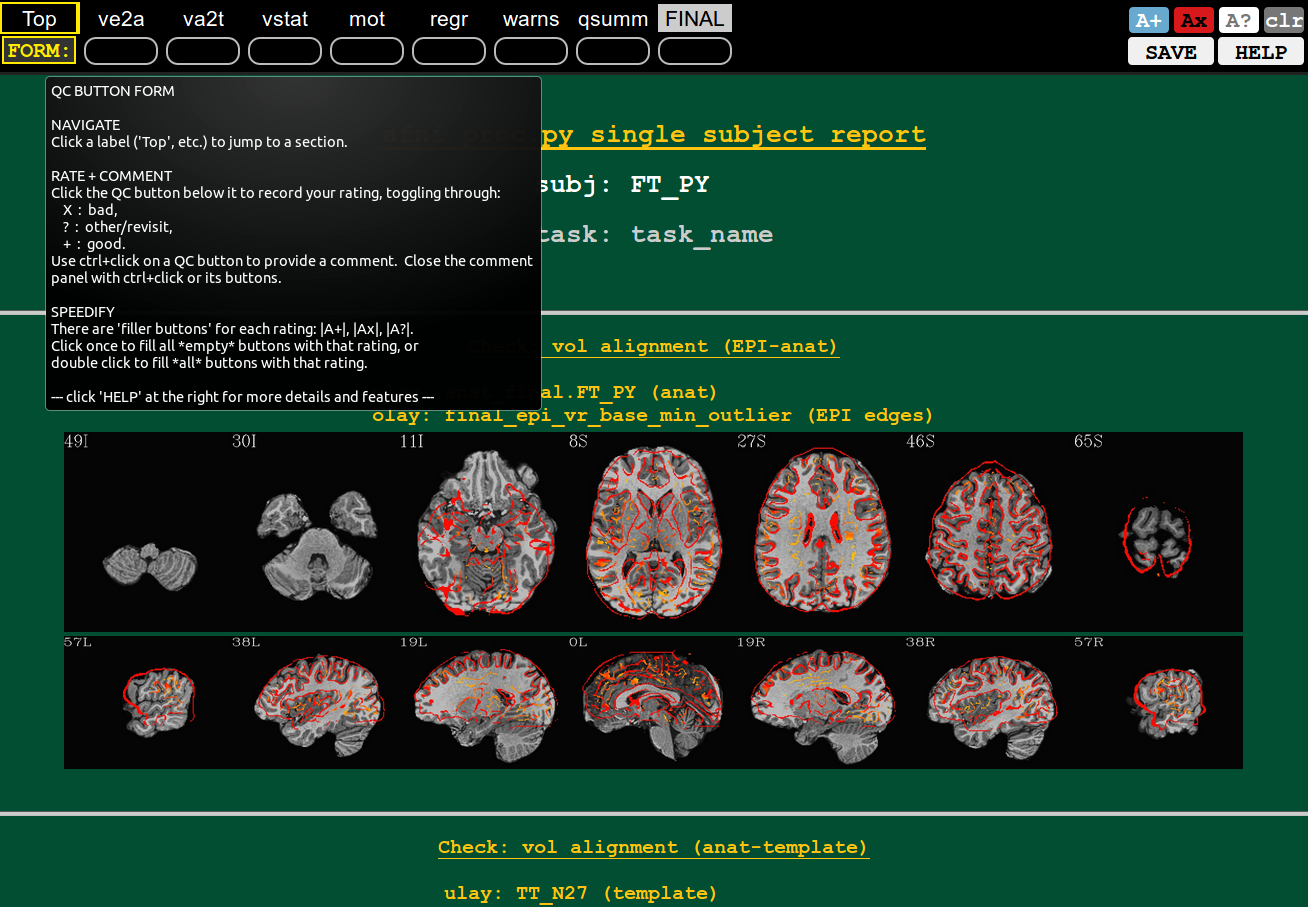
Hover example: “FORM:” button |
|---|
|
You can hover the mouse over most buttons that have text, and see what each does (or, in the case of the QC block labels, a longer description of the label abbreviation).
In the example shown here, hovering over the “FORM:” button contains a quick description of the rating+commenting system.
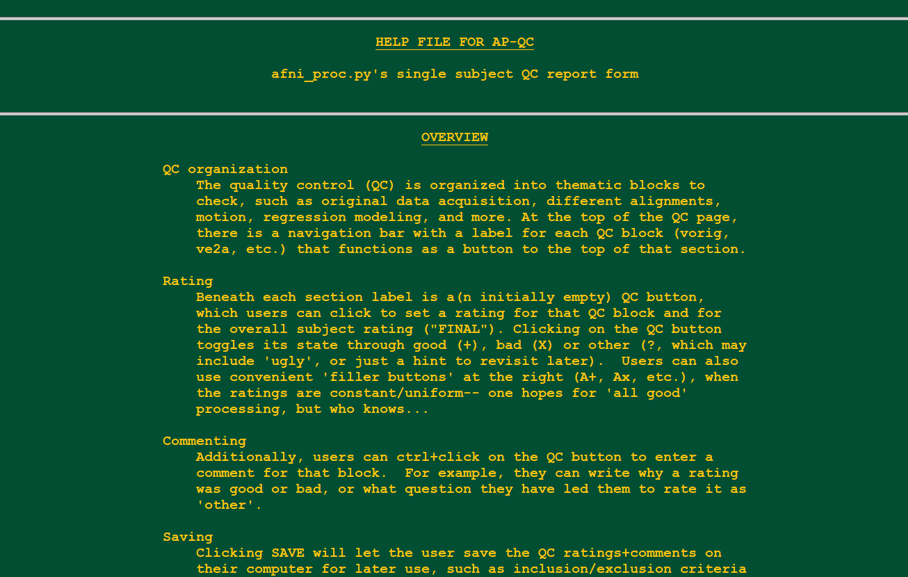
Main (long) help
Help file in new tab (from “HELP” button) |
|---|
|
Clicking on this HELP button in the navigation bar’s lower right
will open up a longer, more descriptive help file in a separate tab.
Top information
Top of the page |

|
The top of the page contains the subject ID or label, as well as the “task” (or study) name*.
* At present, the “task” is just a place holder; the functionality to pass along the real one will be coming soon.
QC Block: vorig
Volumetric views of original data.
* Volumetric mages of data (EPI and anat) in original/native space. Coming soon.
QC Block: ve2a
Volumetric views of EPI-to-anatomical alignment |
|---|
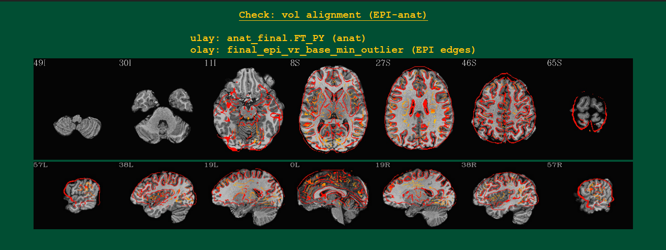
|
Volumetric images of the alignment of the subject’s anat
(underlay/grayscale) and EPI (overlay/hot color edges) volumes.
Likely these will be shown in the template space, if using the
tlrc block.
QC Block: va2t
Volumetric views of anatomical-to-template alignment |
|---|
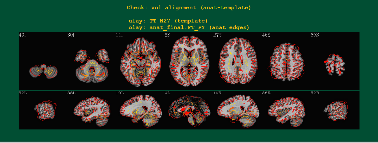
|
Volumetric images of the alignment of the standard space template (underlay/grayscale) and subject’s anat (overlay/hot color edges) volumes.
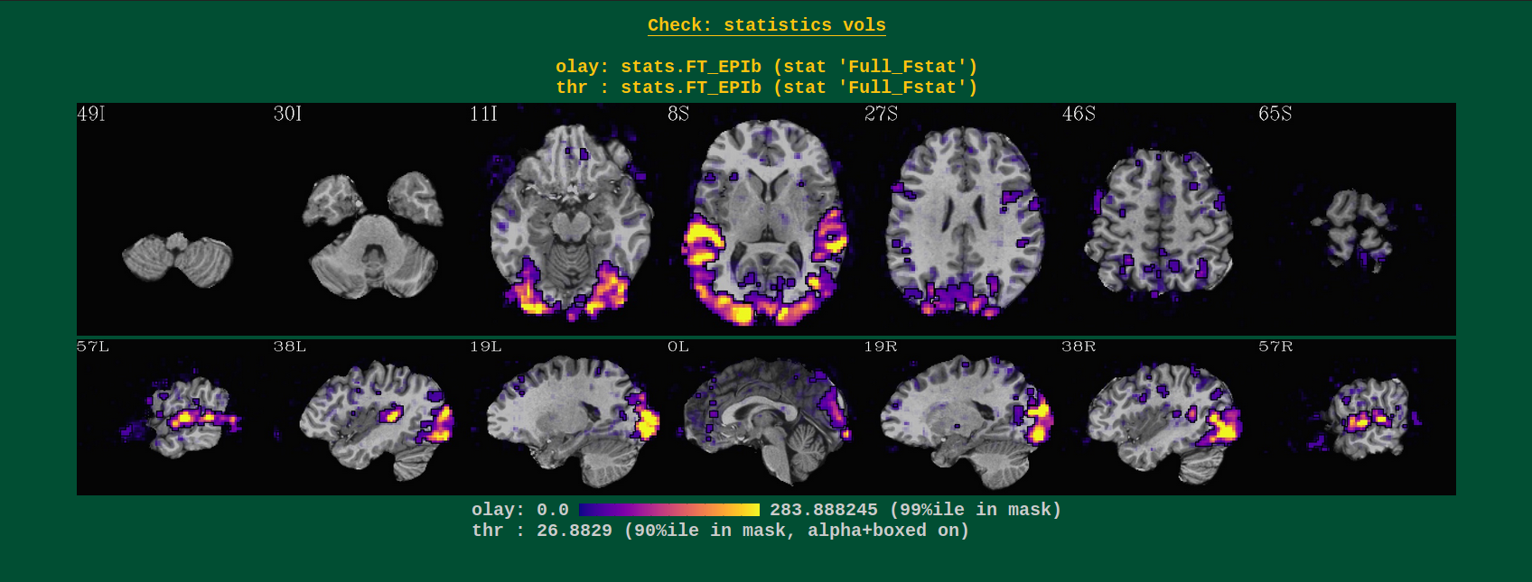
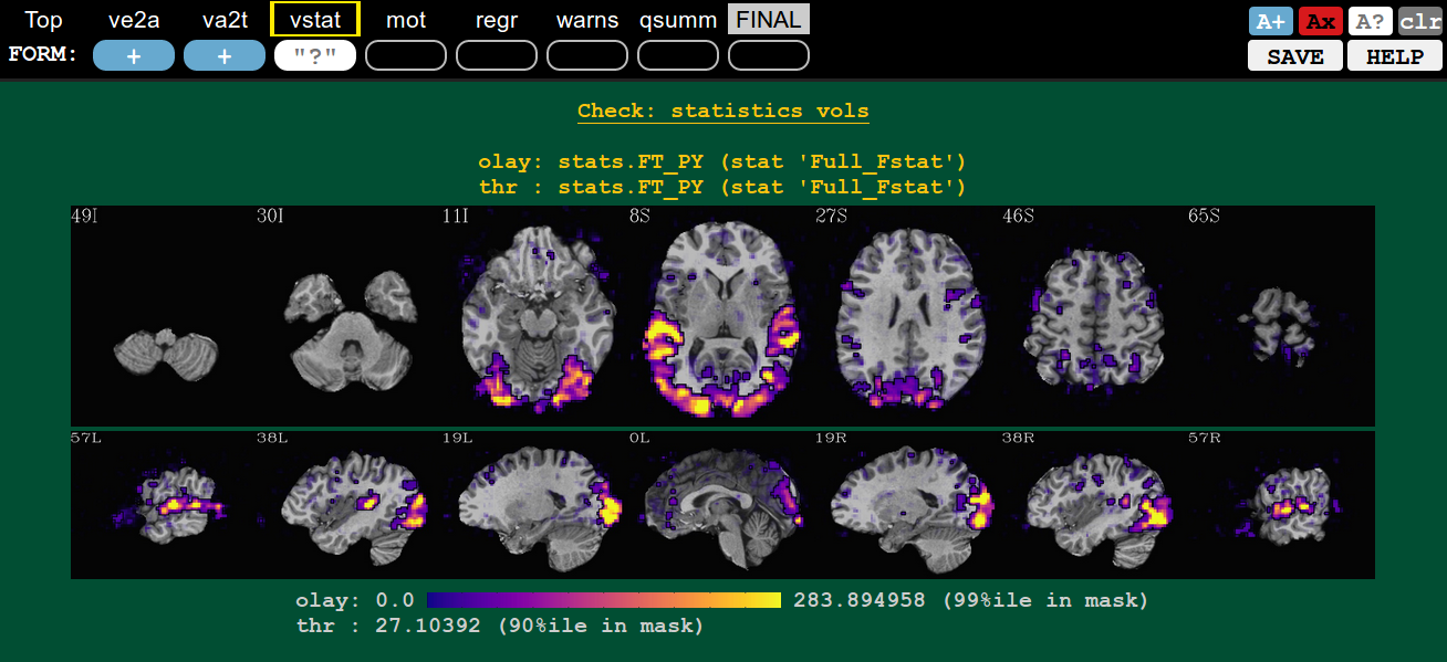
QC Block: vstat
Volumetric views of statistics |
|---|
|
Volumetric images of (full) F-stat of an overall regression model. These images are only created for task data sets, i.e., where GLTs or stimuli are specified (so not for resting state data).
This block gives a general sense of the model specification. One should check for large F-stats in brain regions related to the tasks at hand (here, visual and audio regions– yay!). The overlay is made using the “alpha” and “block” functionalities of the AFNI GUI overlay– voxels with sub-threshold stats still can be seen, they just become increasingly translucent. The threshold is chosen to be the 90th %ile of the stats within an approximate brain mask, so you should see roughtly the top 10% of results in the brain.
Weirdness in these images might include seeing no strong regions of high-stats, instead just speckly stuff. That might be a sign of motion (check the “mot” QC block to verify!). Or that your subject fell asleep, did the task wrong, or perhaps the stimuli files are incorrect (correct units? correct files?).
* At some point, users will likely be able to flag QC images of specific contrasts to be included here. Unless that proves too difficult.
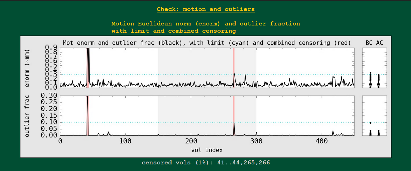
QC Block: mot
Motion-related plots: enorm estimates |
|---|
|
In AFNI, we generally combine the volume-to-volume motion estimation of the 6 rigid body motion parameters (3 rotation, 3 translation) into the Euclidean norm (enorm) quantity. That single number representing motion in units something like mm can be thresholded for censoring (data at those high-motion time points won’t be used in analysis– and because enorm is based on a derivative, both the point of high enorm and the preceding point get censored).
Censoring can also occur by measuring the volumetric outlier fraction (outlier frac): how many voxels out of a whole brain mask exhibit time series outliers in a pre-motion correction volume?
These plots are shown here, with the combined censoring in each case highlighted with red bars. The user-chosen censoring limits for each parameter are shown by the cyan, horizontal dotted line. For each parameter, summary boxplot distributions are made at the right: the BC ones “before censoring” and the AC ones “after censoring”.
The fraction of censored volumes, as well as AFNI-string selector form of the censored points, are shown below the plot.
If multiple runs are included in the afni_proc.py command, then
the background alternates between white and light gray, showing the
range of each.
To enable having equal-axes across subjects, the window height is set to be 3x the censor limit; when things are much higher than that, the exact number doesn’t really matter. NB: as a quirk of this, some of the highest outliers in the BC boxplots may not appear in the visible graph window.
Note that the width of the censor lines is small but finite. As the number of time points N increases and their separation on the x-axis decreases, it may be that the one censor line’s width exceeds that interval. So, visually, it might take up more than 1/Nth of the area of the plot; however, the reality of the situation should still be clear with the fraction of censored volumes.
Motion-related plots: outlier estimates |
|---|
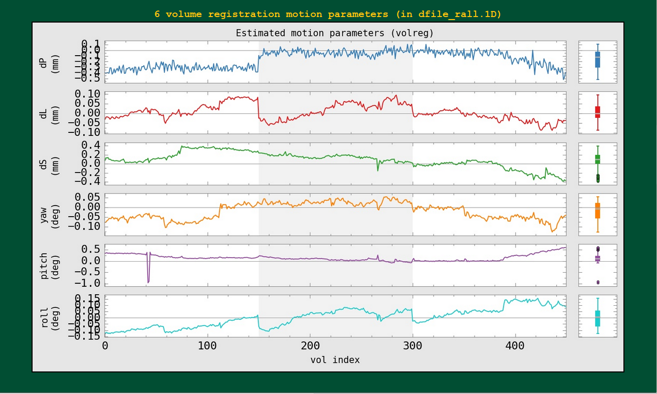
|
The individual motion parameters themselves, with boxplots, are shown here. The censoring isn’t shown in these plots (though, again, if multiple runs are included, the background color oscillated between white and gray to show each).
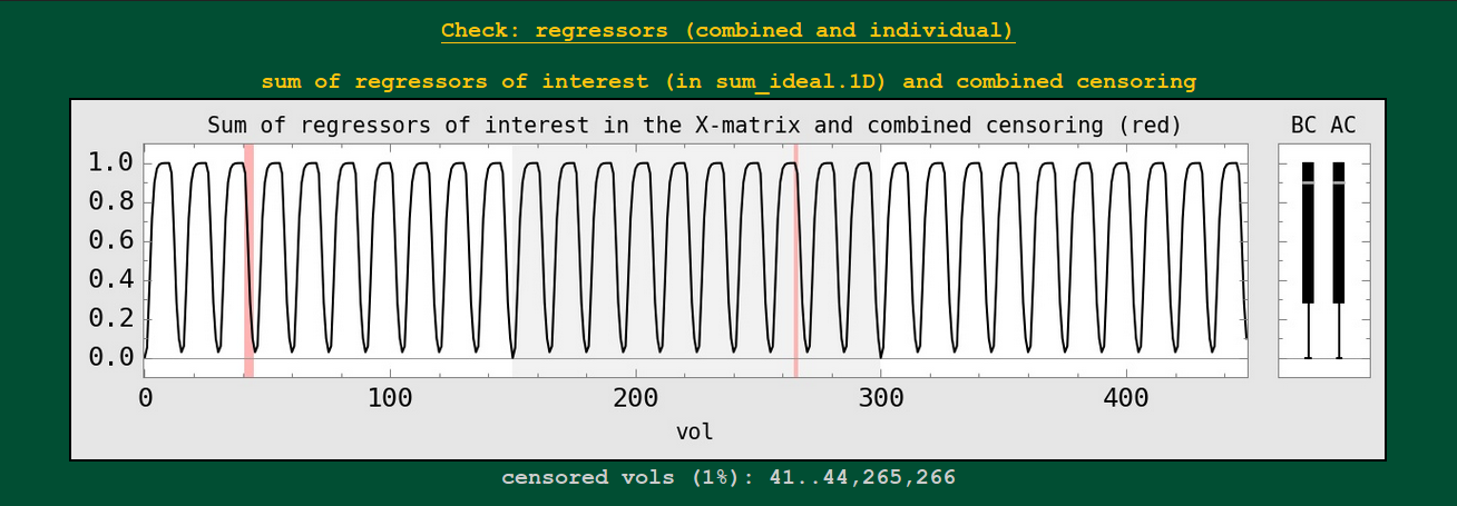
QC Block: regr
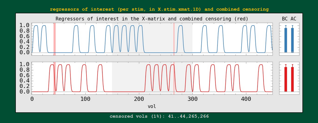
Regression modeling: combined stimulus plots |
|---|
|
The sum of regressors is shown as a 1D plot, with the BC (before censoring) and AC (after censoring) boxplots to the right. These show the stimulus convolved with a specific response/HRF.
This might be useful to check against having oddly overlapping stimuli, duplicated stimulus files, incorrect units, etc. Also, if the median value changes a lot between the BC and AC boxplots, that would be one sign of having a particular stimulus greatly affected by the censoring (which might be problematic for the quality of that subject’s data set).
These images are only created for task data sets, i.e., where GLTs or stimuli are specified (so not for resting state data).
Regression modeling: individual stimulus plots |
|---|
|
Each individual regressor from the input stimulus is shown.
* Labels per stimulus will be coming! and maybe even censor counts per stimulus.
Regression modeling: degree of freedom info |
|---|
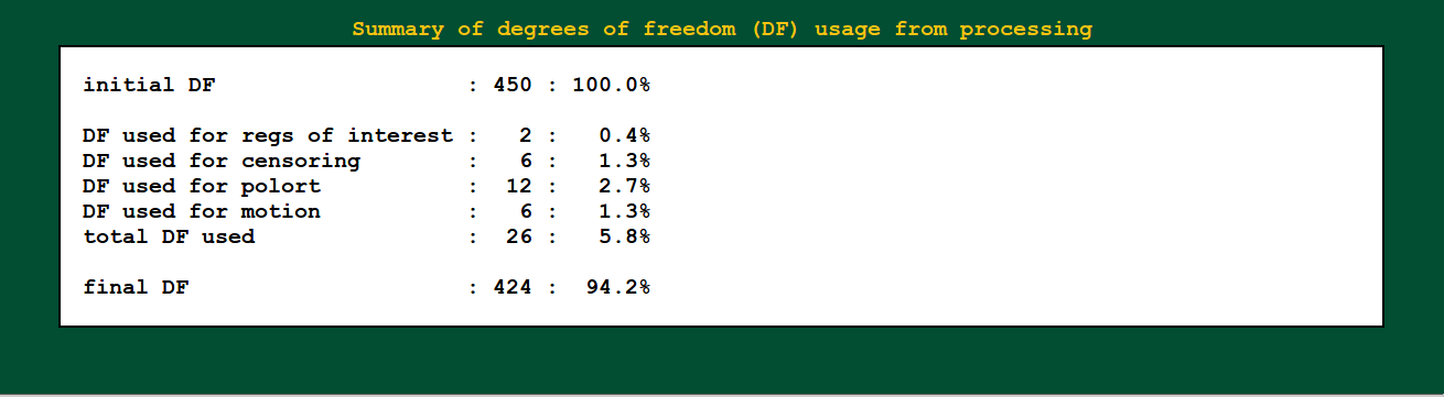
|
Degrees of freedom are important! You need to report them when presenting statistics. You also need to check that they don’t dip down too low due to having a lot of motion (each censored point is one DF used up), too many regressors, etc.
For you resting state people: each frequency that you bandpass uses up 2 degrees of freedom. You should strongly consider whether bandpassing is necessary in your study– don’t just do it because the cool kids are! (Esp. if you have a low TR, you will reeeaaally use up degrees of freedom quickly.)
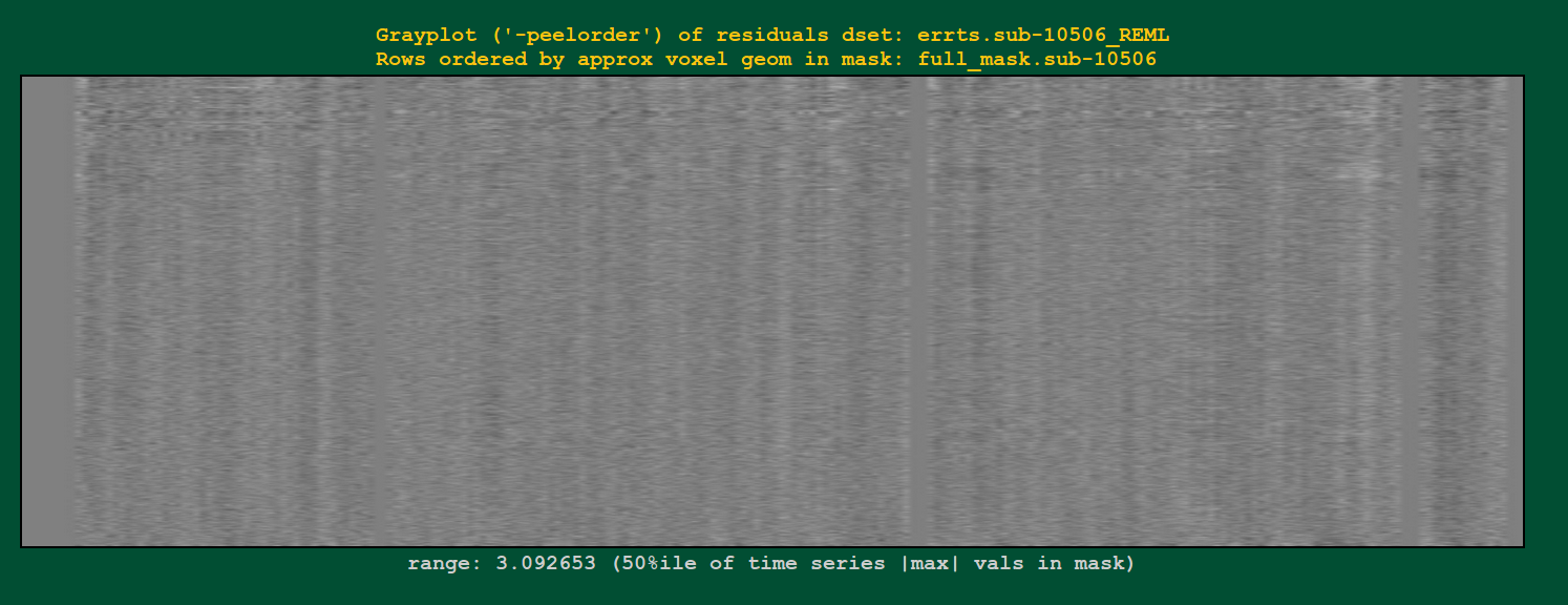
Regression modeling: grayplot of residuals |
|---|
|
Grayplots of residuals: each row shows a grayscale version of a time series, and each column is one timepoint. Only voxels within a brain mask are included in the plot. Note that censored time points will appear as uniformly blank columns.
The colors are mapped as MAXVAL to white and -MAXVAL to black (recall: residuals should be roughly centered around zero), with a hopefully reasonable MAXVAL found from the distribution of time series values throughout the mask (gory details: take the max of the absolute value of each time series, and then take the 50th percentile of that set of values).
In what order are the voxels selected to fill rows? Well, it’s done
in a way to preserve a bit of localness, so that neighboring rows
should be neighboring voxels, usually. See the “-peelorder” option in
3dGrayplot).
Grayplots are one way to look at a whole brain’s worth of FMRI data and assess some aspects of modeling, motion, etc., for example as described in this paper. Note that various researchers may have different opinions about interpreting the grayplots and what they mean.
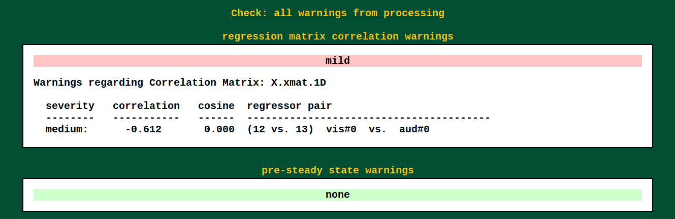
QC Block: warn
Warnings from processing |
|
Several programs used by afni_proc.py's scripts carry out
consistency checks. They can warn against things like having
pre-steady state time points still in the data, or having high
collinearity of regressors, and other things.
Note that not all bad things will get found by the warnings– check all your data processing steps carefully, and have an idea of what problems might occur/look like. But the warnings will try to help you find problems, too.
Warnings from processing: left-right flip check |
|---|
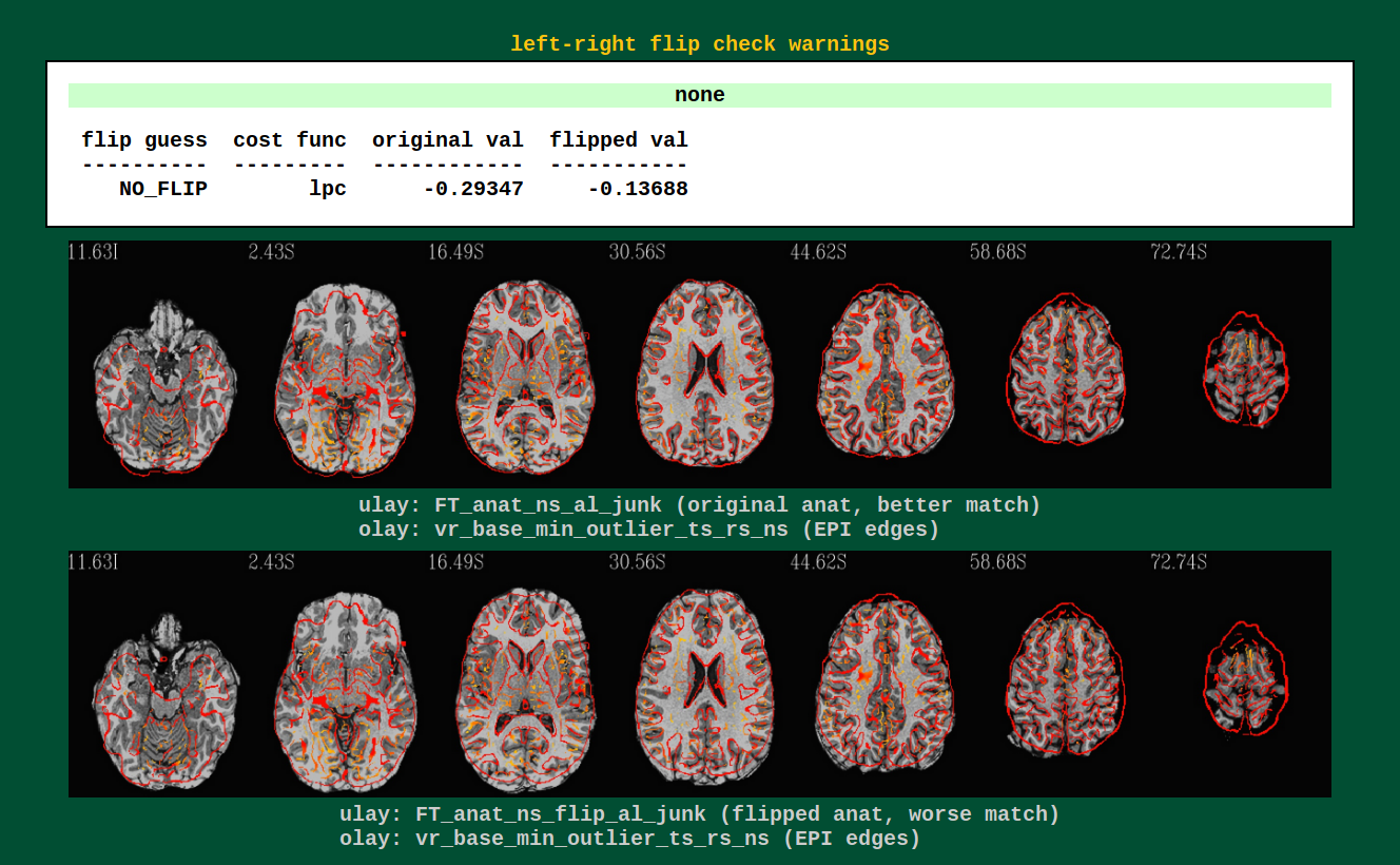
|
Data can have funny (= not funny) things happen to it. One example is
that header information can be translated incorrectly, and a dset can
pick up a flip of orienation; anterior-posterior changes can be easily
noticed by eye, but left-right flips are muuuch more subtle and
therefore troublesome. AFNI’s align_epi_anat.py can perform a
check to see if a subject’s EPI and anatomical have a relative
left-right flip (NB: it can’t detect an absolute difference, nor
does it tell which one is flipped).
Several data sets from public repositories (e.g., from Functional Connectome Project, OpenFMRI) have been found to have a left-right flip. Researchers should always check their own data, esp. when it is this easy to do so!
QC Block: radcor
@radial_correlate plots (per run, per block).
Warnings from processing |
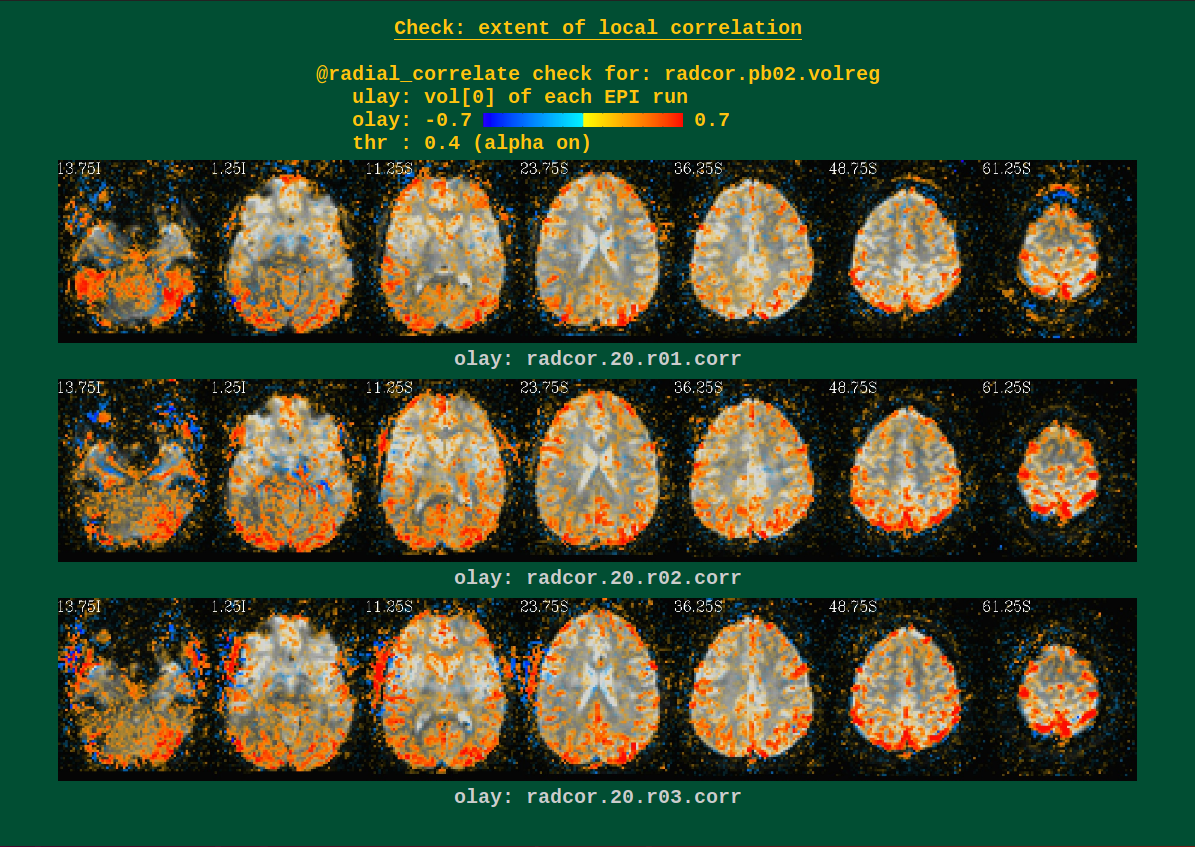
|
These can show scanner coil artifacts, as well as large subject motion; both factors can lead to large areas of very high correlation, which would be highlighted here.
Users can perform this check during several of the afni_proc.py
processing blocks. See the -radial_correlate_blocks therein for
more information.
QC Block: qsumm
Quantitative summary values |
|---|
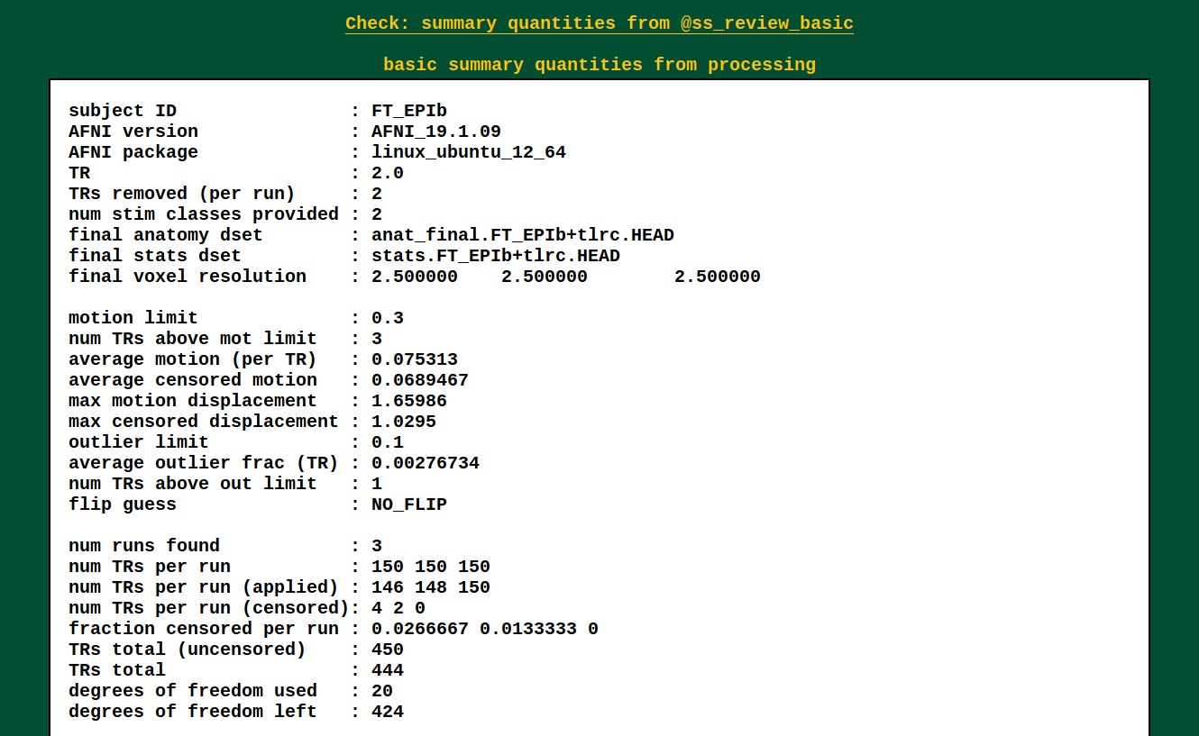
|
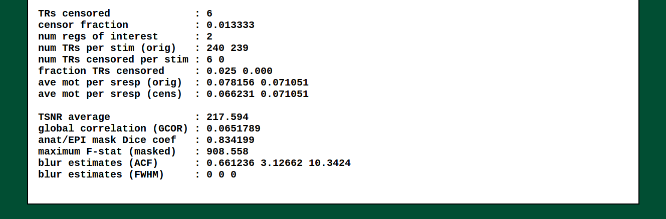
|
This is the output of @ss_review_basic, which contains a loooot of
useful information about your single subject processing. There is max
motion, TSNR, smoothing values, counts of outliers, reminders of some
parameters, etc.
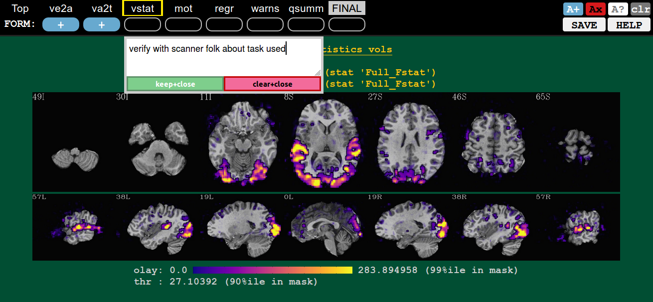
How to: comment
Ctrl+click on QC button to open comment |
|---|
|
In addition to making a rating for a given QC block (or the FINAL evaluation), you can record comments about it. To open a comment, hit ctrl+click the specific QC button. Then you can type whatever you want (though, the assumption is you are not writing a Russian novel here, and also don’t require fancy formatting).
You can either keep your comment (hit Enter at any point, or the green “keep+close” button), or clear it (hit Esc at any point, or the magenta “clear+close” button).
QC buttons with comments have quotation marks around rating, e.g., “?” |
|---|
|
You can see that a QC button has a comment, because the status symbol (+, X, ?) will be surrounded by quotation marks (“+”, “X”, “?”).
If you add a comment to an unrated QC button, it will automatically get a rating of “?”. You can alter the rating even when a comment is present.
A note about saving comments: these are saved in the apqc*json file in the QC-directory. As noted here, this process is subject to browser constraints. Life is hard.