12.2.1. The Plus/Minus (PMplot) Curves in Graphs
How-to
The PMplot feature allows the user (you) to plot a range plus and minus around a time series graph from a dataset. The range data comes at each voxel from another dataset, and is plotted plus and minus about the “base” dataset. That is, if the voxel value is 100 and the range value is 10, then the “base” curve will be at level 100 and the plus/minus curves will be at 110 and 90.
Getting this feature to work requires a few steps, which are
illustrated in words and screen captures. In the example, the datasets
are called Qorig.nii and Qsqrt.nii, which each have 242 time
points.
You need the two time series (3D+time) datasets; where those come from is entirely up to you.
Then, you open the AFNI GUI, choose
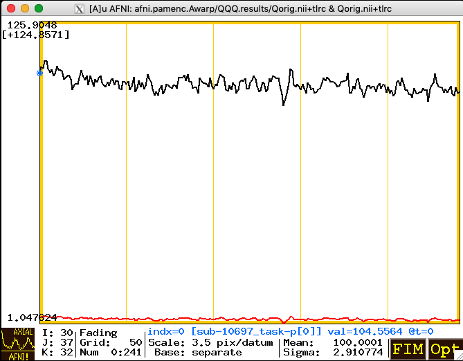
Qorig.niias the Underlay dataset, and open one of the Graph viewers. Below, I’ve switched the number of sub-graphs shown (the “matrix” value) down to a single curve, using the Opt->Matrix menu (or the ‘m’ keystroke shortcut).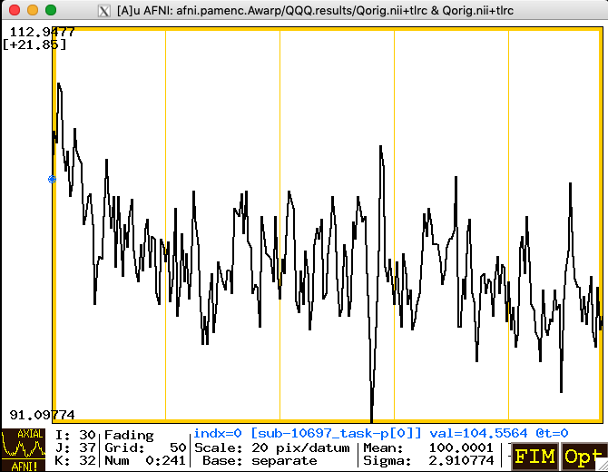
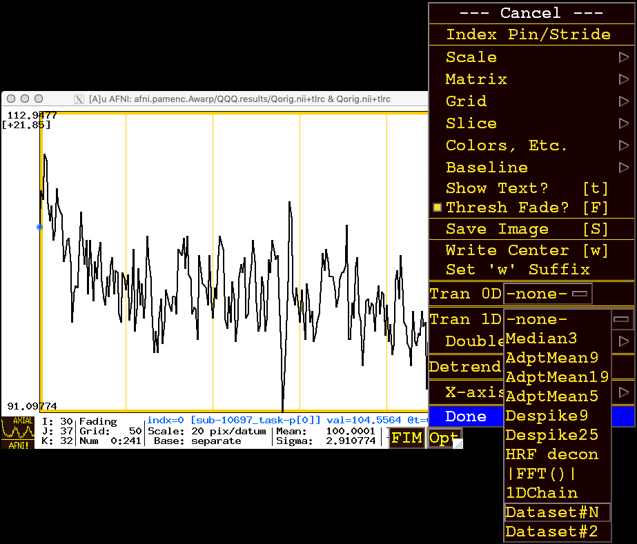
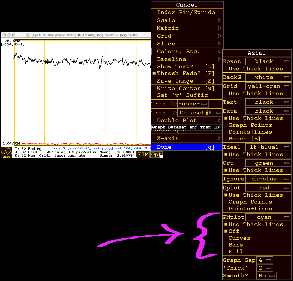
You use the sub-menu item Opt->Tran 1D->Dataset#N to open the plugin that lets you choose the auxiliary dataset for graphing. After that dataset is chosen, you will make that dataset be graphed as a PMplot rather than the default of just making it an extra graph curve plotted on top of the base graph. The image below shows the menu path from Opt to Tran 1D to Dataset#N.
When you click/release on Dataset#N you will get a plugin popup as shown in the image below. Click on the square box to the left of Input#01 to activate that row, then use the Choose Dataset button to select the plus/minus range dataset; in this example,
Qsqrt.nii.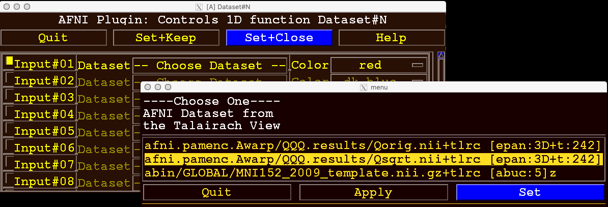
Then click on the Set button in the dataset chooser (lower right in the image above), and then click on the Set+Close button in the plugin controller. These actions will “send” the chosen dataset to the AFNI graph viewer to be plotted as an auxiliary curve. At this point, this auxiliary curve is just plotted as a new curve (in red), along with the base curve. In this example, the range dataset is considerably smaller than the base dataset, so the extra curve appears way below the original curve (shown below):
You use the Opt->Colors, Etc.->PMplot menu items to tell AFNI that this auxiliary dataset is to be plotted as a plus/minus range about the base dataset, rather than as an independent curve (which is the default way to plot an auxiliary dataset time series). The image below shows what the menus look like when you press Opt, then select the Colors, Etc. sub-menu; near the bottom is the PMplot set of items. Note that at this point, PMplot is turned Off.
There are 3 ways to display the plus/minus range:
If you choose Bars (two items below Off), you get vertical bars plotted around the base curve, shown below:
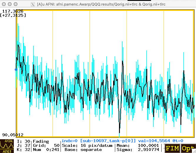
Above, the bars are colored in cyan, which is the default color in the PMplot menu section. You can change that color by going to Opt->Colors, Etc. again.
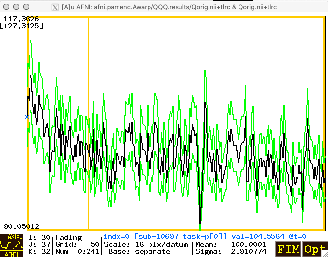
You can also choose to plot the range as Curves around the base curve (below, in green):
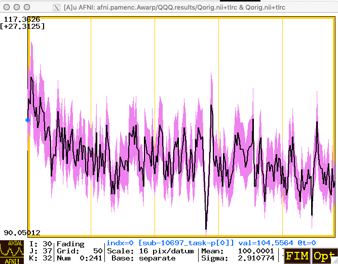
... or as a Fill-ed area (below, in violet):